Tailwind CSS components
Ship websites fast, with Tailwind UI components
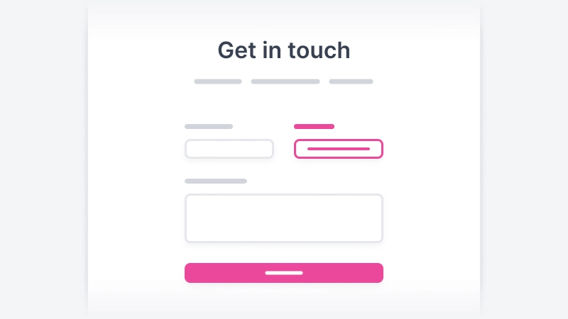
Htmlwind is a UI components library made with Tailwind CSS. Comes with beautifully designed UI components, blocks, and sections for your next project.
Browse components


Features
Everything you need to build beautiful websites
Spend less time coding and more time creating. Htmlwind provides all the essentail components you need to bring your projects to life with ease.

Components
225+ Tailwind UI components
Hundreds of pre-designed UI components for all your websites that follows accessibility criteria.

Compatibility
Universal tech stack support
Fully compatible with every framework where Tailwind CSS is used — React, Vue, Laravel, and much more.

Responsive
Fully responsive components
Every component is made to look great on all screen sizes — mobile, tablet, and desktop.
<div class="bg-white py-24 sm:py-32">
  <div class="mx-auto max-w-7xl sm:px-6 lg:px-8">
    <div class="relative isolate overflow-clip bg-gray-900 px-6 pt-16 shadow-2xl sm:rounded-3xl sm:px-16 md:pt-24 lg:flex lg:gap-x-20 lg:px-24 lg:pt-0">
      <div aria-hidden="true" class="absolute right-0 top-0 -z-10 aspect-square w-full max-w-3xl translate-x-3/4 rounded-full bg-pink-500/60 blur-[10rem] lg:-top-[40rem] lg:left-1/2 lg:-translate-x-1/2"></div>
      <div class="mx-auto max-w-md text-center lg:mx-0 lg:flex-auto lg:py-24 lg:text-start">
        <h2 class="text-3xl font-semibold tracking-tight text-white sm:text-4xl">Want to partner with design experts in SaaS?</h2>
        <p class="mt-6 text-base text-gray-300">We're excited to talk to you about your project requirements and business goals.</p>
        <div class="mt-10 flex items-center justify-center gap-x-6 lg:justify-start">
          <a href="#" class="rounded-md bg-white px-3.5 py-2.5 text-sm font-semibold text-gray-900 hover:bg-gray-100 focus-visible:outline focus-visible:outline-2 focus-visible:outline-offset-2 focus-visible:outline-white">Schedule a call</a>
          <a href="#" class="text-sm font-semibold leading-6 text-white">Send an email</a>
        </div>
      </div>
      <div class="relative mt-16 h-80 lg:mt-8 lg:h-auto">
        <img width="1920" height="1139" class="absolute left-0 top-0 w-[58rem] max-w-none rounded-2xl bg-white/5 ring-1 ring-white/10 lg:top-14" src="https://htmlwind.com/assets/images/dark-dashboard-screenshot.webp" alt="dashboard screenshot" />
      </div>
    </div>
  </div>
</div>
Usability
Easy to use
No setup required! Copy the code and paste into your project and customize them as needed.
Components
Stunning UI components built with Tailwind CSS
Over 225 beautifully designed, fully responsive Tailwind CSS components. Add them to your projects and customize as needed to quickly build professional looking websites.

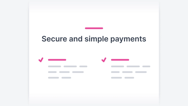

Pricing
Lifetime access, one-time cost
Personal
$79
one-time payment
plus taxes
For solo developers with unlimited personal and commerical projects.
Get all access-
225+ components – Beautiful and responsive components which you can use to build application UIs and marketing sites.
-
Unlimited projects – Use Htmlwind for all your personal and client projects.
-
Lifetime access – No subscription, no renewals, pay once and use it forever.
-
Free updates – Get all future updates and any new components we add in the future at no extra cost.
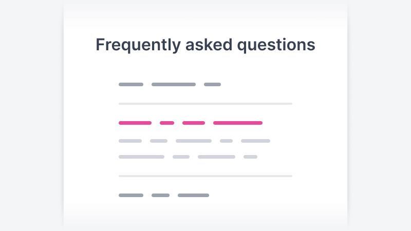
FAQs
Frequently asked questions